30%
Increase in claims through the app
30%
International member acquisitions
2x
Increase store Rating
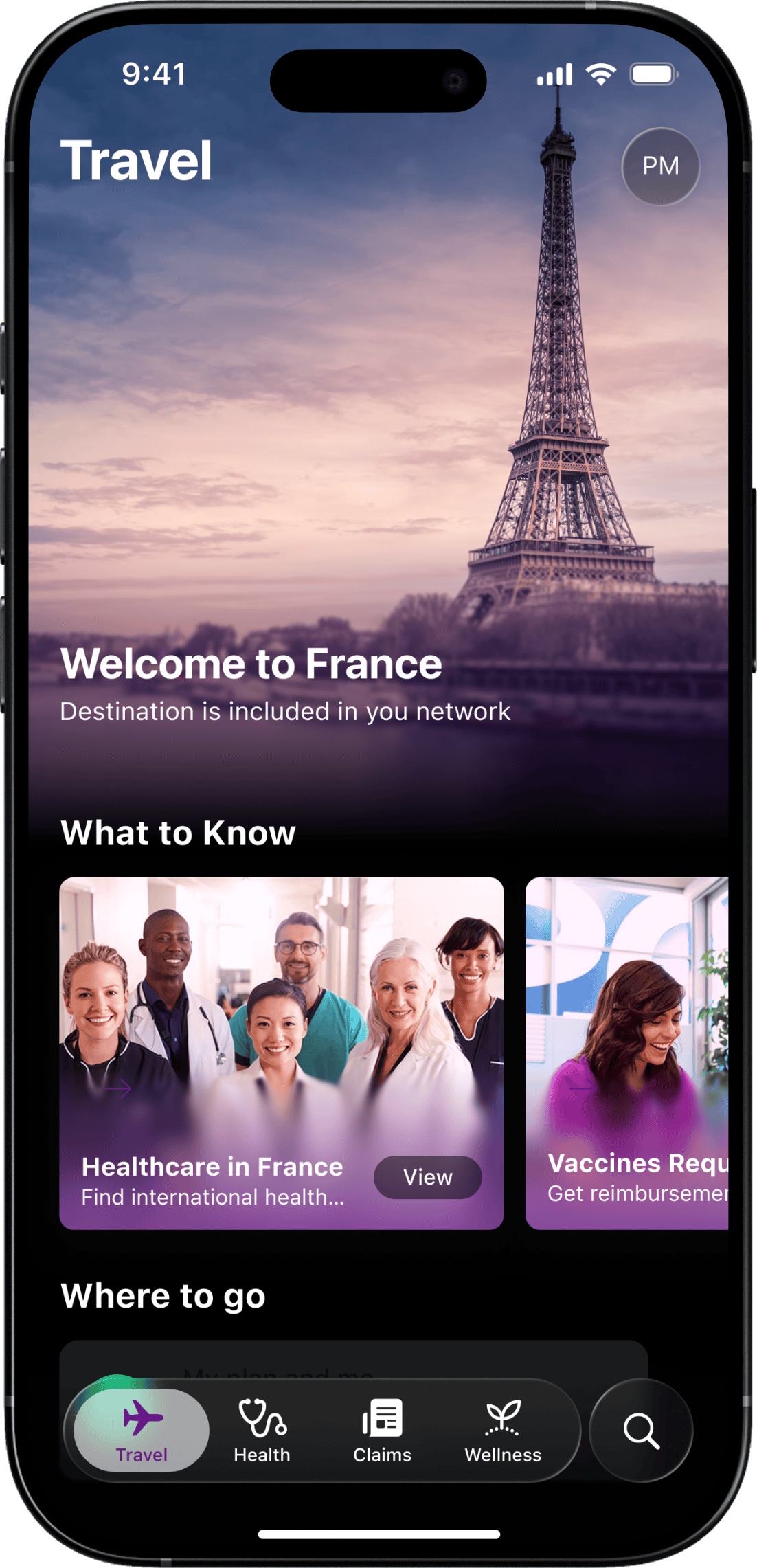
Helping Members Around the World
Aetna is one of the largest healthcare companies in the U.S., with a mission to improve the health and well-being of people everywhere. For their international division, the member experience had become a barrier. Their mobile app and web portal—key tools for accessing care abroad—were falling short. Members struggled to find providers, file claims, or even understand how the product worked. Support call volumes were high. App reviews were low. Acquisition was slowing. The experience needed more than polish—it needed a strategic rethink.
My Role in the Reinvention
As Head of UX, I led our team’s approach from the top down, defining the strategy, aligning the cross-functional teams, and working with product and business stakeholders to make sure we were solving the right problems, not just redesigning the interface. This was not just a UX cleanup, it was an experience overhaul driven by research, metrics, and empathy.
The Gap We
Aimed to Bridge
The original experience was too complex and too disconnected from what members actually needed. Key tasks, such as filing a claim or finding a nearby doctor, were buried in confusing flows. Many users didn’t understand what the app could do or how to do it. That led to rising support calls, negative app reviews, and lost acquisition momentum. Our goal was to bring clarity, confidence, and usefulness back to the experience, making the platform not just usable, but genuinely valuable.
My Contribution
to Their Mission
We started with a full discovery phase, working closely with stakeholders across product, claims, and service teams. We interviewed users, audited flows, reviewed store feedback, and mapped the journey across mobile and web. We uncovered the pain points, the drop-offs, and the invisible moments that eroded trust.
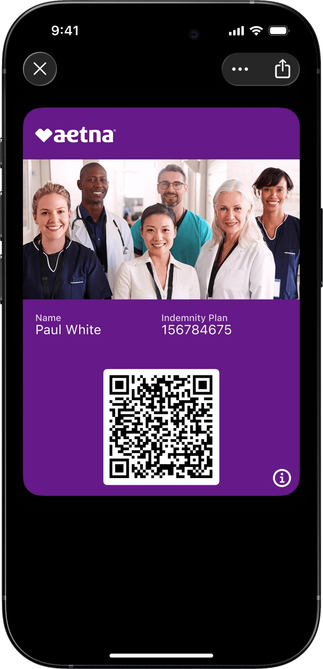
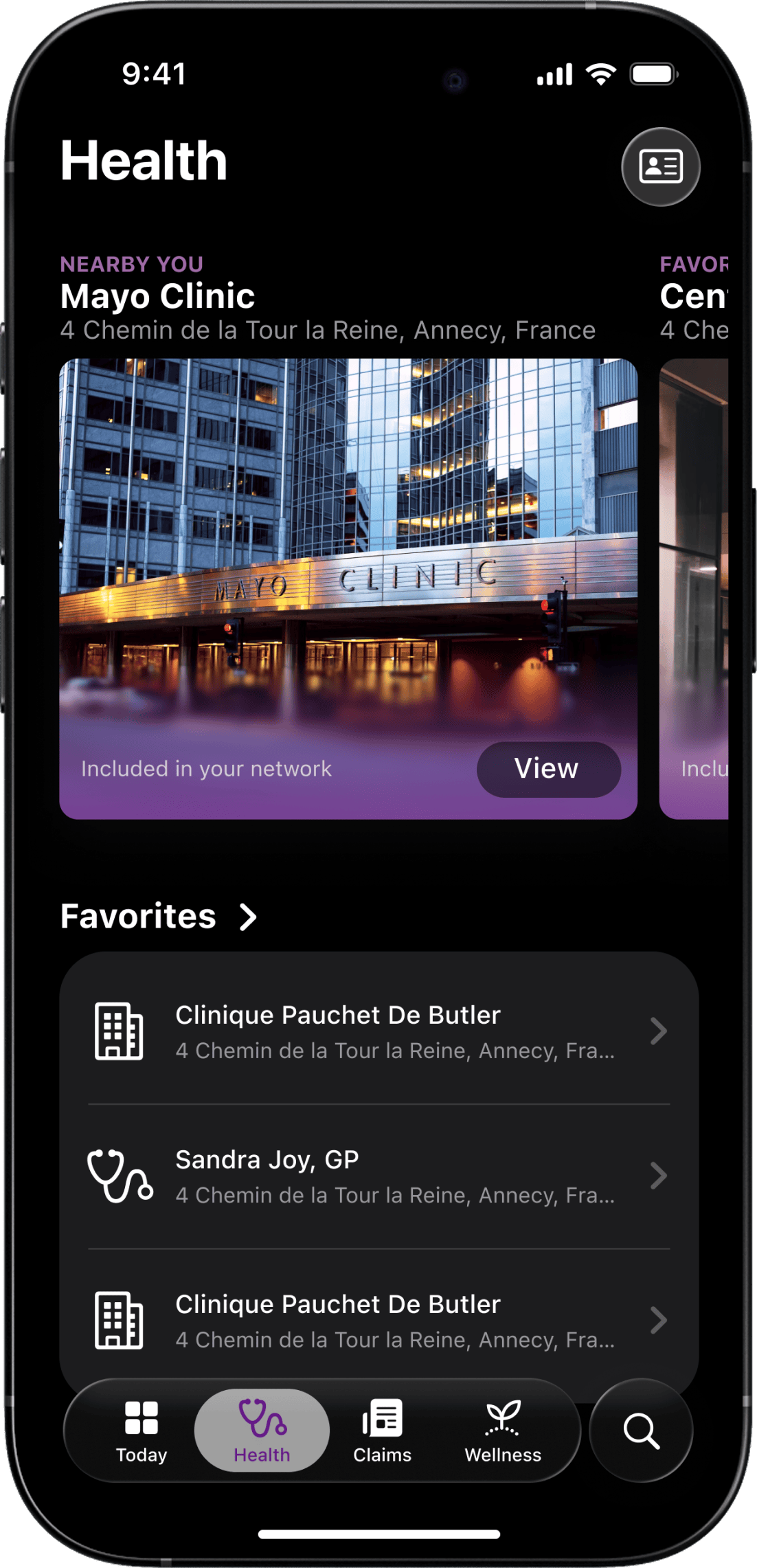
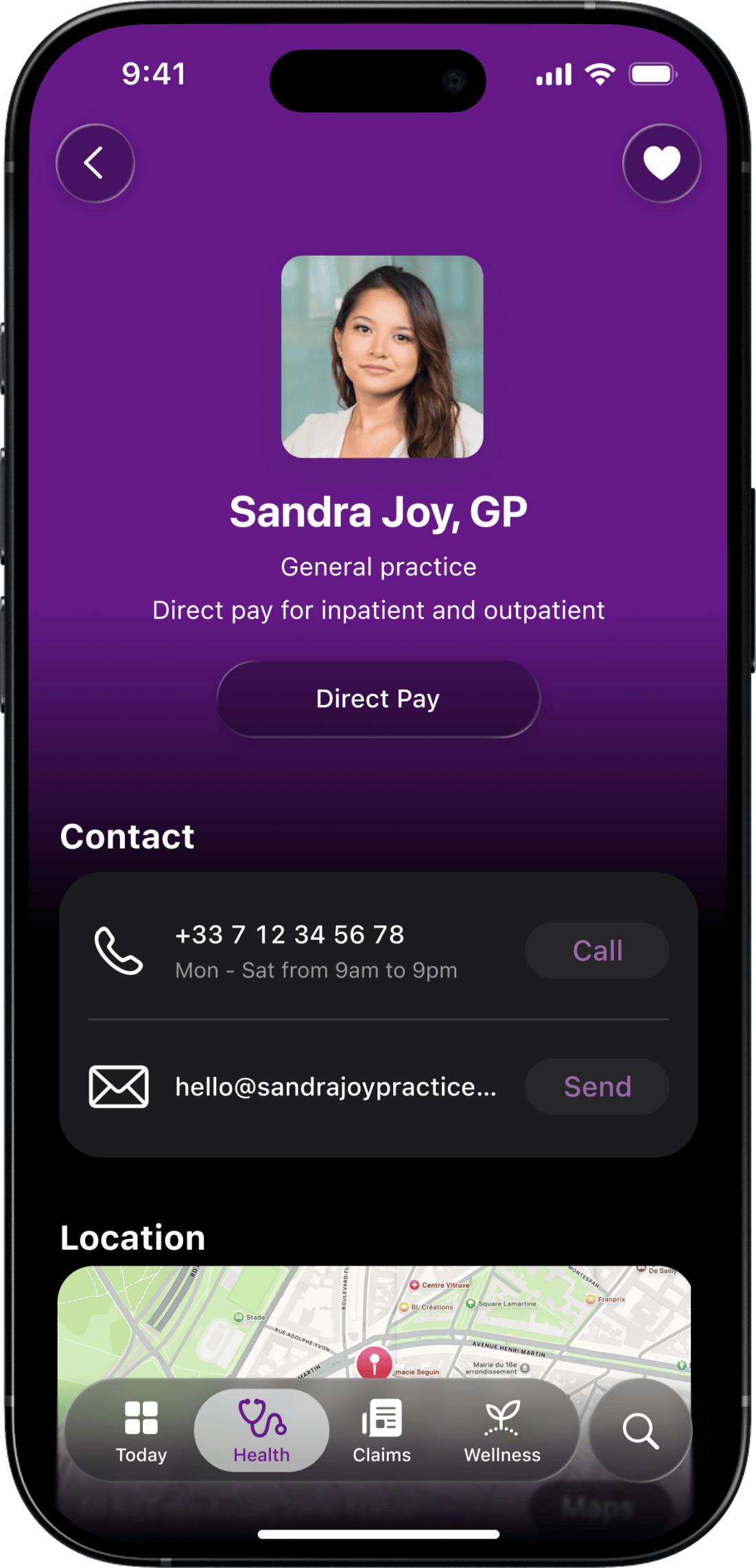
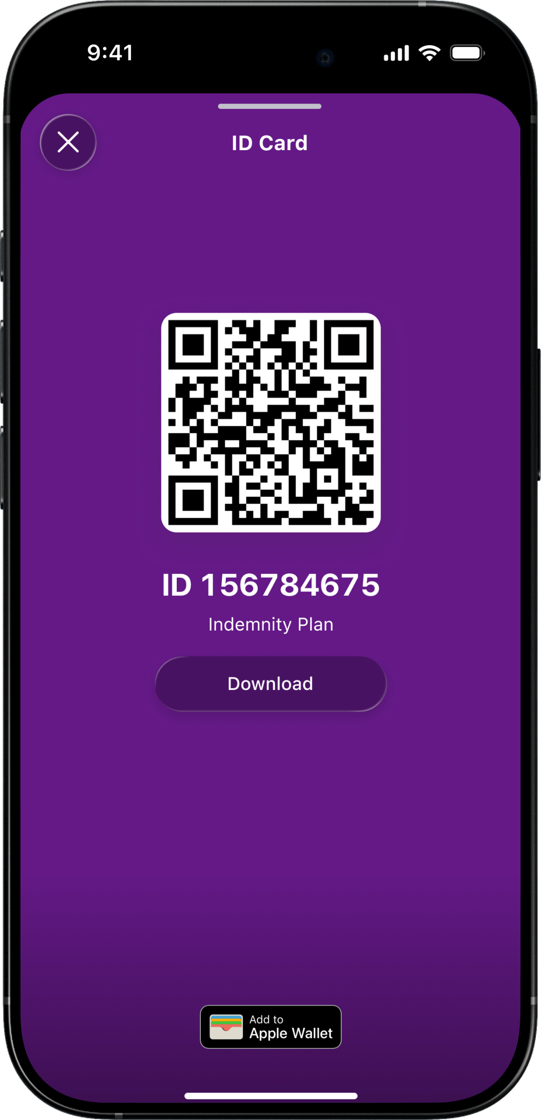
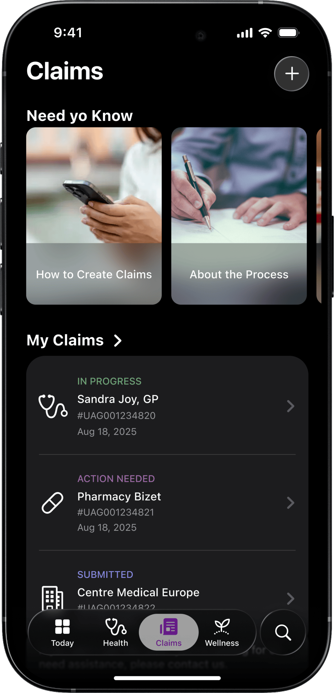
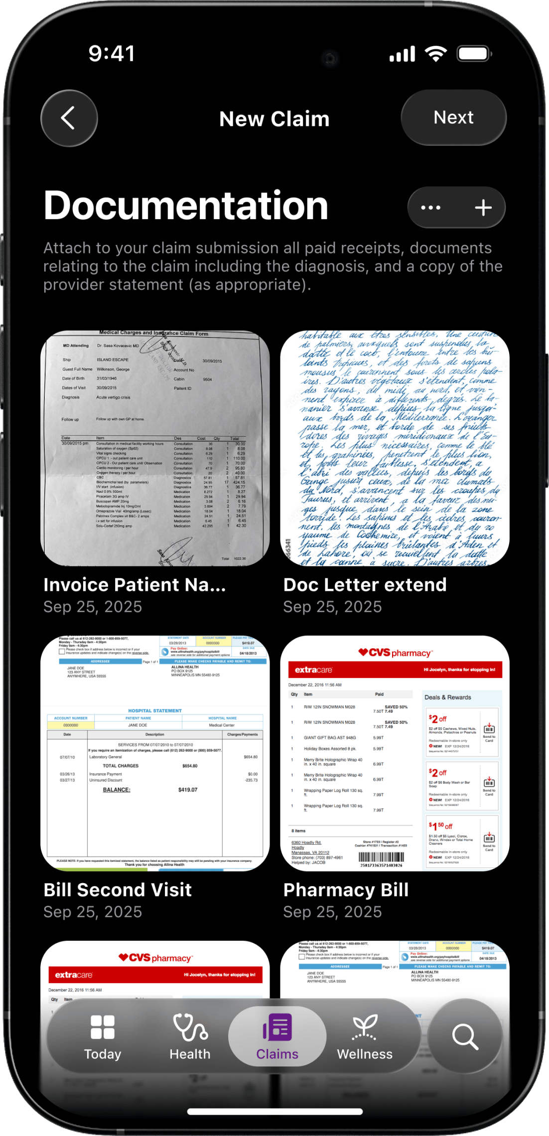
Complex Journeys, Low Adoption
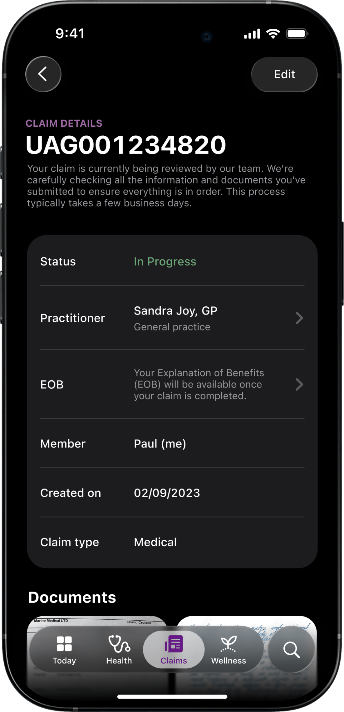
Members dropped off in key flows like claims and provider search. Tasks took too long or failed to meet expectations, impacting adoption and satisfaction.
Support Overload
The confusing experience led to a growing volume of support calls, taxing the internal teams and creating friction for users seeking quick answers.
Disconnected Web and Mobile
Members moved between devices, but the experience didn’t. We saw inconsistencies in flows, language, and functionality between the portal and app.
Lack of Strategic Metrics
There were no clear KPIs tracking how the app contributed to business goals like acquisition or claim submission, making it hard to measure or improve.
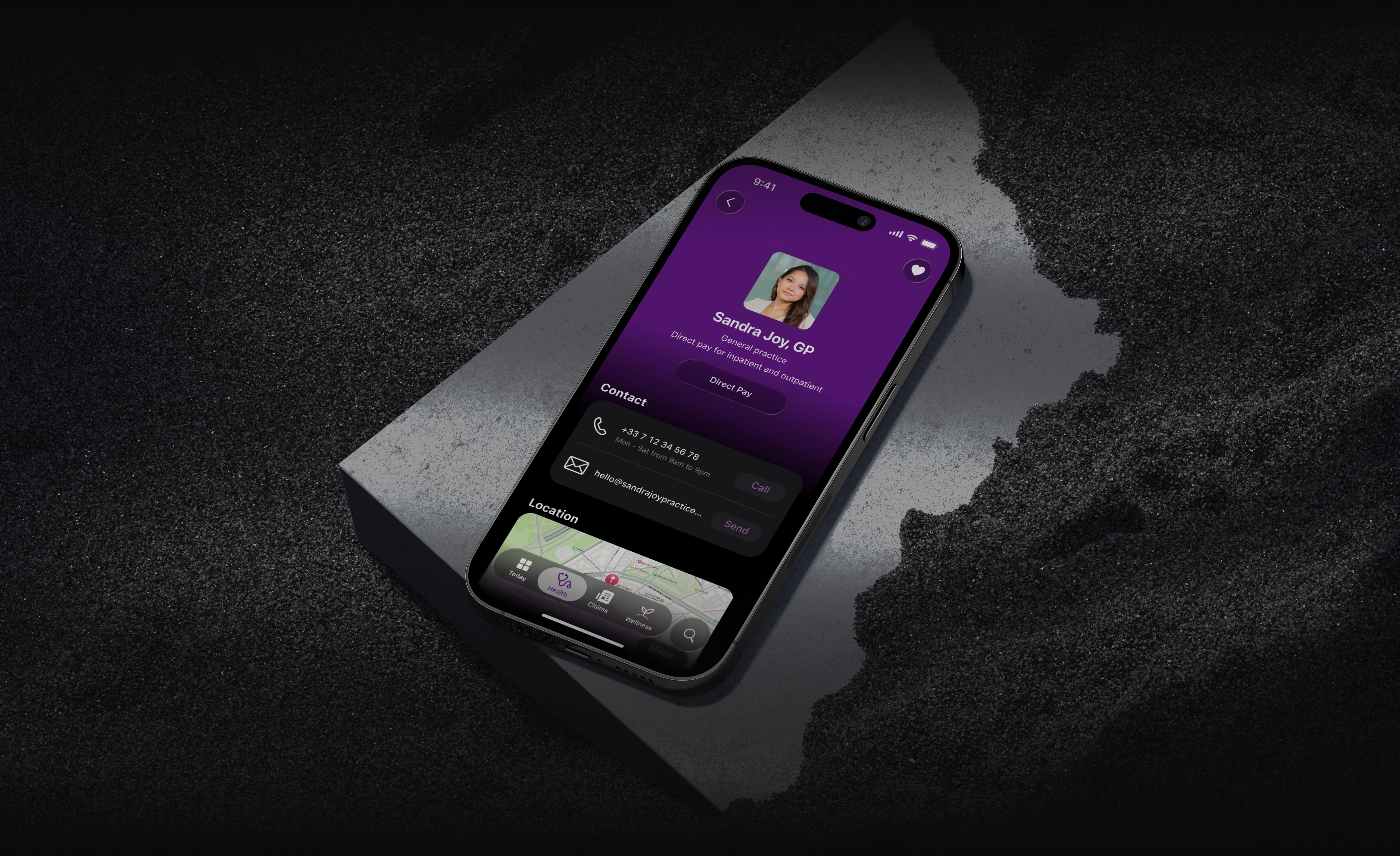
Based on these insights, we rebuilt the user journeys for clarity and simplicity—starting with the two most critical: filing a claim and finding a provider. We introduced clearer language, guided flows, and meaningful feedback loops. We also defined a set of KPIs tied to business outcomes, giving the team the data they needed to guide improvements going forward.
What We
Achieved Together
For People. Members could now navigate their healthcare experience with confidence. The redesigned app and portal made it easier to search, submit, and feel supported—wherever they were in the world.
For the Business. The impact was clear: a 30% increase in claims submitted through the app, a doubling of app store ratings, and reduced support calls. Most notably, Aetna saw a >30% increase in international member acquisition through the app channel alone.
For Me. This was a reminder that meaningful change often starts by listening well and simplifying boldly. I’m proud of how we turned friction into flow, and helped real people feel seen and supported when they needed care the most.